The temptation to frequently alter visual branding can be strong—especially in the dynamic realm of advertising. However, the true strength of a brand is embedded in its consistent visual identity.
This steadfastness not only amplifies recognition but also cultivates trust among consumers. Extending a brand’s visual expression while maintaining consistency with core brand aesthetics is a challenge that requires a thoughtful creative approach.
The importance of consistency
The robustness of a visual brand is gauged by its ability to maintain a consistent image across all platforms. It’s not merely about repeating logos and colors; it’s about delivering a coherent visual narrative that resonates wherever the brand is presented. Consider Apple’s clean and minimalist design or Starbucks’ iconic green and white logo. Both brands achieve instant recognition through consistent, custom imagery. Visual consistency extends beyond logos, encompassing typography, imagery, and color schemes that become synonymous with a brand. By ensuring uniformity in these elements across all touchpoints, a brand reinforces its identity and builds a strong emotional connection with its audience.
Establish visual systems
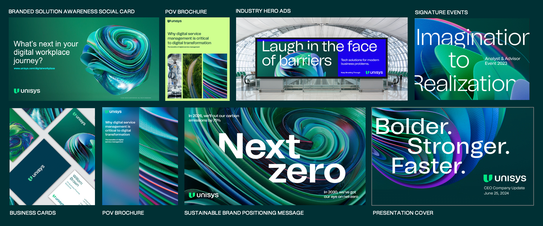
Maintaining visual consistency is vital for reinforcing a brand’s identity across various mediums. McDonald’s, for example, utilizes the same shades of red and yellow in TV commercials, online ads, and store designs. This uniformity ensures that customers instantly associate these colors with the brand, no matter where they encounter it. Nike’s consistent use of its font and swoosh logo across all communications also strengthens brand recall. Unisys reinforces its modern new visual identity with a carefully balanced vibrant color palette, custom imagery and illustrations, and a unique shape language.
Commit to brand guidelines
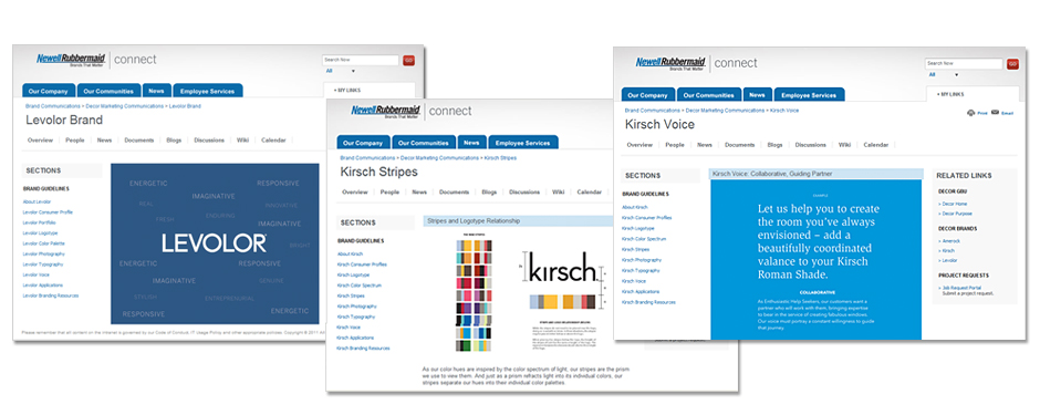
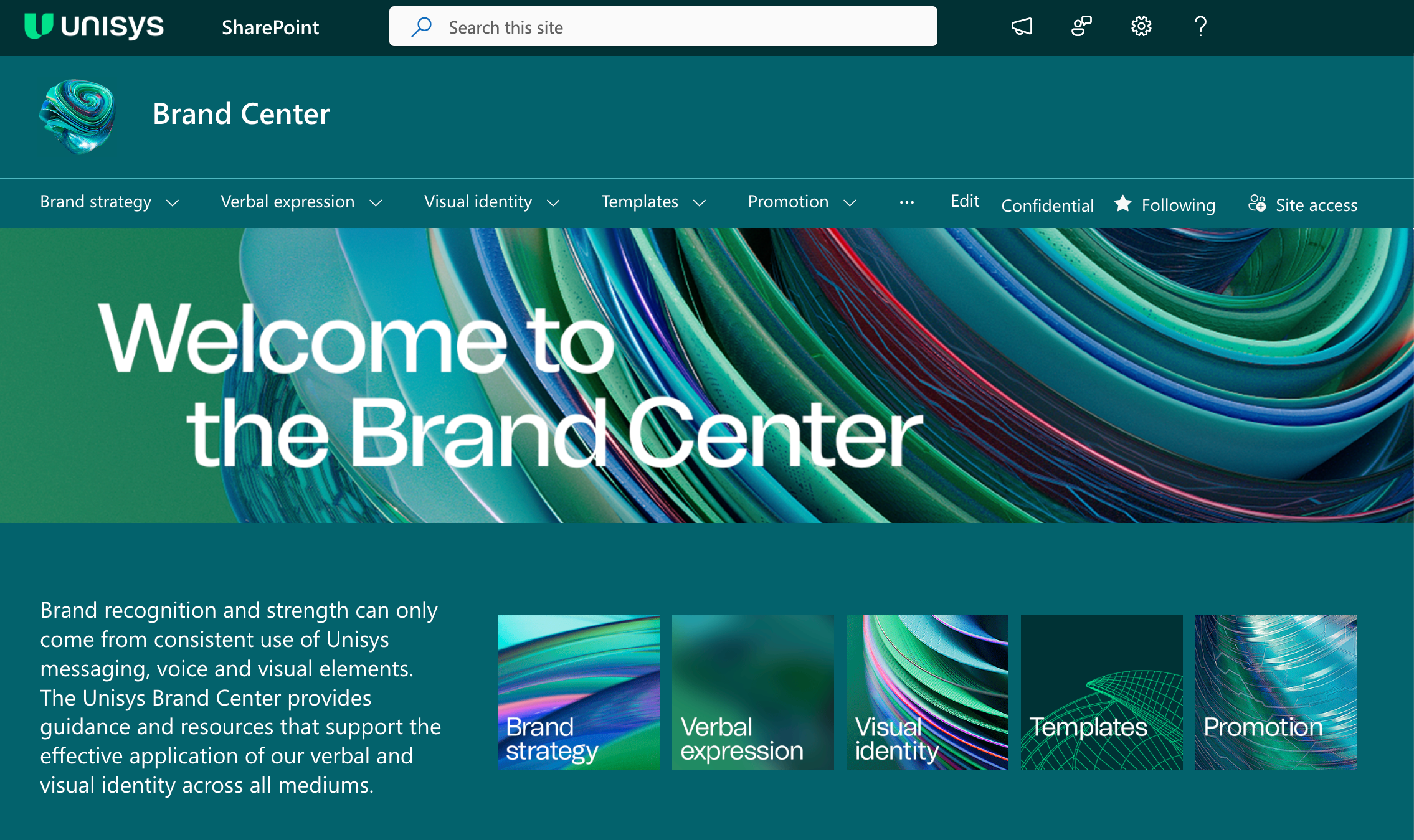
Establishing visual consistency begins with a detailed brand style guide that outlines specific guidelines for color usage, typography, logo placement, and more, guaranteeing that all marketing materials present a unified image. Brand guidelines act as a roadmap for all communications, ensuring every marketing piece, regardless of the medium, reflects the brand’s ethos. It’s vital that everyone, from designers to marketers, understands and adheres to these guidelines to uphold the brand’s integrity. When Netflix updated its branding, it maintained the core elements consistently across all platforms, ensuring that their message and aesthetic were unified and instantly recognizable. Conducting training sessions and workshops will educate those who produce branded documents and assets, and help them learn the importance of adhering to the guidelines. Both Newell and Unisys established brand portals to serve as references for associates, agency partners and vendors who produce assets.
Avoid impulsive changes
Abrupt changes might seem appealing, but they can confuse customers and dilute brand identity. It’s essential for brands to evolve with purpose. Thoughtful, strategic updates that align with a brand’s core values are far more effective than reactive changes. Coca-Cola’s slight alterations to its logo, for example, maintain its nostalgic appeal while keeping the design contemporary. The subtle updates to its logo demonstrates evolution without compromising its essence. Disciplined creative direction is also critical in establishing and maintaining baselines of visual design and application. Brand development is often an expensive investment that should be managed with a trusted, steady hand. Too many “cooks in the kitchen” can splinter and subvert a carefully planned cohesive visual strategy, and ruin visual brand consistency. Conducting regular audits and reviews of brand materials helps identify inconsistencies early and ensures all elements align with the brand’s evolving strategy.
Key elements of brand consistency
- Logo usage: stick to one version of the logo across all platforms to avoid confusion.
- Color palette: limit the brand to a specific set of colors to reinforce visual identity.
- Typography: strengthen brand voice with consistent use of typography.
- Imagery style: maintain a uniform style in all visual content to reinforce brand personality.
Enhance visibility and equity
In a competitive market, a consistent brand cuts through the clutter. Maintaining a distinct visual style ensures a brand remains prominent and top of mind. Amazon’s consistent use of its smile logo across various platforms, from their website to packaging, reinforces their brand identity consistently, boosting customer recognition and loyalty. Consistent visual branding not only aids in visibility but also bolsters marketing campaigns, making them more effective as the brand image becomes more familiar and reliable to the audience. And, consistency does not have to be boring. Thoughtfully applied creative ideas can extend core brand guidelines with strategic use of foundational elements while staying true to a brand’s aesthetics.
As the market evolves, the need for a cohesive visual brand identity becomes increasingly critical. A disciplined approach ensures that a brand not only remains relevant but thrives. This balance is essential for any brand aiming to maintain a lasting and significant market presence.
Need help developing or extending your visual brand strategy? Contact us for a consultation.